How to make a chess YouTube thumbnail that gets clicks
A great chess YouTube thumbnail is built at 1280 × 720 pixels, leads with high contrast rather than clutter, and carries no more than three to five words of text. Analysis of top-performing thumbnails shows that 89% rely on a clear face or high-contrast color, the median text length is five words, and a strong thumbnail can lift click-through rate by 30–40% — which matters because YouTube uses CTR to decide how many people ever see your video. Because a chess board rarely has a face, your edge is a bold, legible position: a high-contrast theme, a single highlighted move, and a clean frame. This guide covers the exact spec, the research behind each rule, the mistakes that kill CTR, and how to export a thumbnail-ready board free in ChessVG.
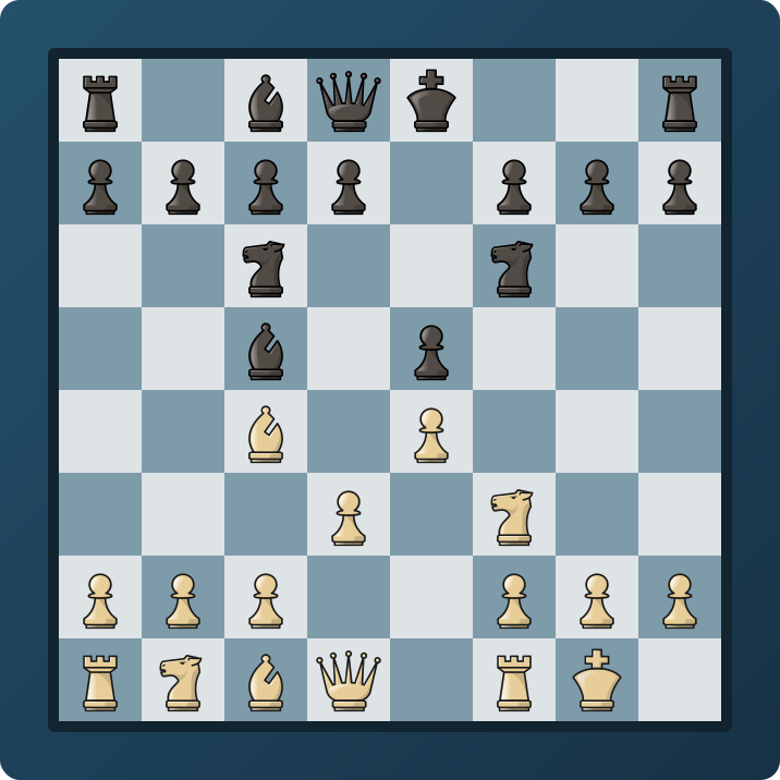
Key takeaways
- Design at 1280 × 720 px, 16:9, PNG, under 2MB.
- Contrast is everything for a board: 89% of strong thumbnails use a face or high-contrast color.
- Three to five words of text, never more than six.
- ~70% of views are on mobile — test your thumbnail at postage-stamp size.
- Higher CTR feeds the algorithm more impressions, so the effect compounds.
Why the thumbnail decides your reach
On YouTube the thumbnail is not decoration — it is the single biggest lever on how many people click. Studies of top videos find that a well-made thumbnail can raise click-through rate by 30–40%, and because YouTube treats CTR as a core signal for how many impressions to hand a video, that lift compounds: more clicks buy more watch time, which buys more impressions. Most channels live in a 2–10% CTR band, so even a two-point improvement is a large share of your reach.
The exact spec
- Dimensions: 1280 × 720 px, 16:9 aspect ratio.
- Format & size: PNG (keeps text and board edges sharpest), under 2MB.
- Safe area: keep the board and text clear of the bottom-right corner, where the duration badge overlays.
These are YouTube's own recommendations, confirmed in vidiq's 2026 thumbnail analysis.
What the research says about design
vidiq analyzed breakout videos and found that 69% featured at least one human face, rising to 80% among the top 50 overperformers, and that 89% used a clear face or high-contrast color, with 56% using high contrast specifically. The lesson for chess is direct: you usually have no face, so the whole burden falls on contrast and a clear focal point. A dark, high-contrast board theme with one boldly highlighted move gives the same instant readability a face provides.
On text, the same analysis found the median thumbnail uses five words, with three to five recommended. Since roughly 70% of viewing is on mobile, anything longer turns to mush at thumbnail scale.
How to make one in ChessVG
- Open the ChessVG editor and set up the exact position from your video — paste a FEN, drag the pieces, or grab it live with the browser extension.
- Pick a high-contrast theme (a dark board like Ocean Blue, Graphite, or Emerald Night makes the pieces pop) and a clean, bold piece set.
- Add a frame and a solid or gradient background so the board sits on a full 16:9 canvas rather than floating.
- In the Export tab choose the YouTube preset, then download a PNG. Add your 3–5 words of text in your video editor over the empty side of the background.
Common mistakes
- Screenshotting a play site. Low resolution, cluttered UI, and inconsistent colors — the opposite of a clean thumbnail.
- Low contrast. A pale board on a pale background disappears in the feed. Go dark and bold.
- Too much text. Six or more words are unreadable on mobile.
- Inconsistent style. Reusing one saved template keeps every thumbnail recognizably yours.
FAQ
What size should a chess YouTube thumbnail be?
1280 × 720 pixels in a 16:9 aspect ratio, saved as PNG, under 2MB. Keep the key content — the board and any text — away from the bottom-right corner where the video duration badge sits.
How many words of text should a chess thumbnail have?
Three to five words maximum. Across top-performing thumbnails the median is five words; beyond six words the text becomes unreadable on mobile, where roughly 70% of YouTube viewing happens.
Do chess thumbnails need a face?
It helps but is not required. Most breakout videos use a face, yet 89% of strong thumbnails rely on a clear face or high contrast — often both. For a board-only thumbnail, a high-contrast theme plus one bold highlighted move does the same job.
Related
Making covers for other platforms? Instagram, TikTok, and Facebook each have their own rules. Or start building now in the ChessVG editor.
Sources: vidiq YouTube thumbnail design analysis and custom-thumbnail CTR data; SubSub CTR benchmarks. Figures link to their published pages. This guide is educational; actual results depend on your niche and content.
← All case studies